
Wellbeing Programs
Wellbeing solutions for mental, financial, and physical health positively affect employee productivity and promote a healthy workplace. However, low awareness results in low employee engagement with these programs, causing frustration on employers who invest in these solutions. How might employees easily see relevant programs at the right moment in time?
ROLE
Product Design Lead: Design direction and strategy
Guidance for product designers
TEAM
6 product designers (2 seniors, 4 juniors)
1 director of product management, 1 product managers
2 UX researchers
TIMELINE
6 weeks
Problem
Key findings from our company’s industry research highlighted:
50% of mental health issues receive help
For Millennials and Gen Z, wellbeing is their top criteria when looking for a workplace
On average, only a quarter of employees engage with their wellbeing programs
I also collaborated with the UX research team, and the key themes from their employee interviews were:
Finding programs is difficult. Employees who are actively looking for programs don't know where to find them on their benefits portal.
Program awareness is low. Employees tend to be surprised when they find out a certain program is offered by their employer.
Sentiment around wellbeing programs is positive. Employees would feel more supported if they knew their employer provided programs for their mental, financial, or childcare needs.
Solution
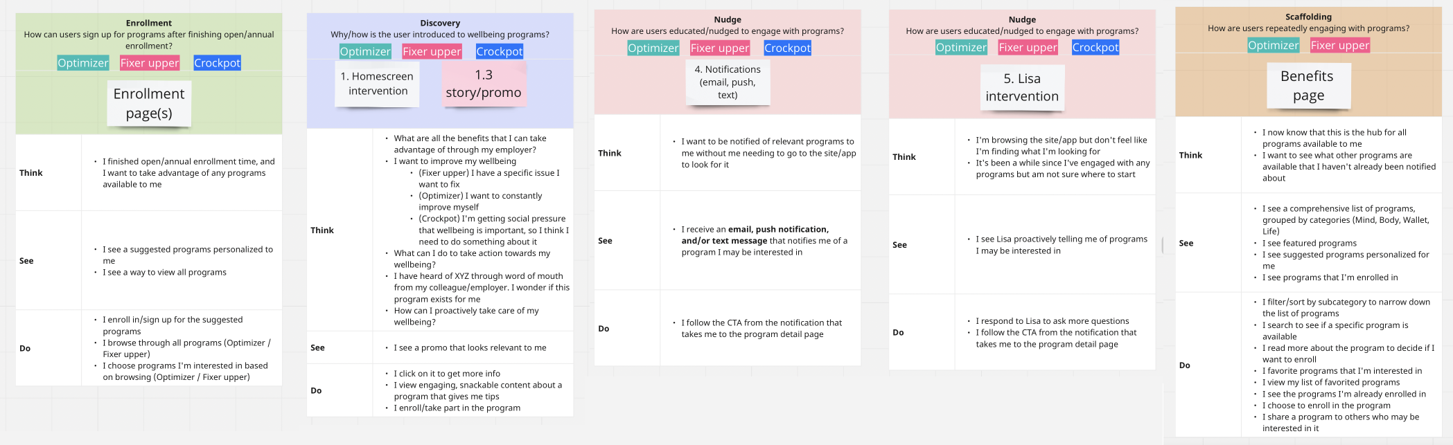
To proactively surface program recommendations, stakeholders and I aligned on 4 main touchpoints.
Enrollment confirmation page
Recommend personalized program to keep users engaged on-site after enrollment
Chatbot
Proactively surfaces with program content and serves as site search
Homepage “Recommended” section
Highlight program suggestions with snackable info
Programs landing page
Includes preference selection and program discovery and browsing
Process
Target persona
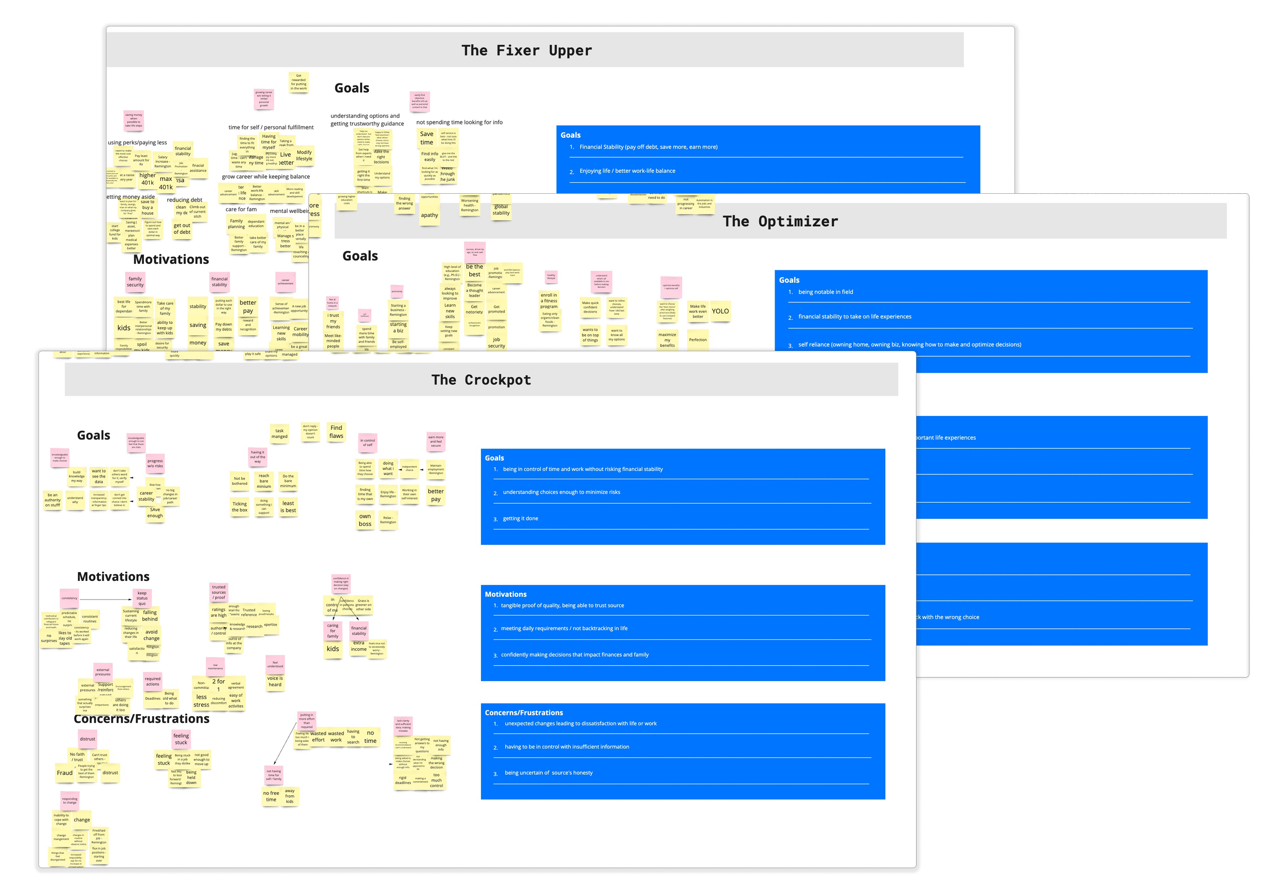
Through a persona ideation workshop, the product team and I aligned on a target persona group called the WIPs (wellbeing-in-progress), which represented the majority of users on the site who would gain the most value from wellbeing programs. The WIPs stemmed from three people archetypes:
The fixer upper, who has a specific issue (financial, health, etc.) to address or improve
The optimizer, who is generally on top of their benefits but wants to make the most of the offerings provided by their employer
The crockpot, who likes the status quo but can be persuaded to make a change as long as they're certain that the change will positively impact them

Storyboarding & user flow
Based on the product team’s scope of touchpoints that would surface wellbeing programs, I created a storyboard outlining what users would think, see, and do, to ground the designers with the overall design strategy and user mindset. Since this project touched multiple program entry points, I also created a high-level user flow to create a shared understanding on how all these pieces fit into the big picture.

Stakeholder feedback sessions
I proposed a time-boxed agenda for the 90-min/2-hour stakeholder feedback meetings to keep the discussion focused and to prevent derailing tangents:
Each designer presents their work (3-5 minutes)
After each design presentation, stakeholders add stickies on the Miro board (4 minutes)
Product manager leads the discussion based on the stickies (6 minutes)

To ensure structured feedback was structured, I leveraged IBM's feedback grid of what worked, what to change, questions, and ideas. After the session, I aligned with stakeholders and design directors on priority design items.
To accommodate stakeholders who could not attend the reviews, I had designers record a 3-min video to walk through their designs and rationale, as this helped build their presentation skills and also provide stakeholders an accompanying voice-over while they reviewed the prototype on their own time.
Designs iterations
Enrollment confirmation page
The confirmation page appeared after users completed enrollment, and its main purpose was to surface follow-up actions based on their enrollment choices.
INITIAL CONFIRMATION PAGE

FINAL CONFIRMATION PAGE

Homepage "Recommended" section
The “Recommended” section, which mimicked social media stories, provided bite-sized info about programs. The feature received positive user reaction with users expressing more interest compared to previous homepage banners.
INITIAL RECOMMENDED SECTION

FINAL RECOMMENDED SECTION

Chatbot interaction
The chatbot proactively engaged users to offer personalized program recommendations.
INITIAL CHATBOT INTERACTION

FINAL CHATBOT INTERACTION

Preference selection
The preferences selection modal asked users about their wellbeing interests so that the site could offer personalized program recommendations.
INITIAL PREFERENCE MODAL
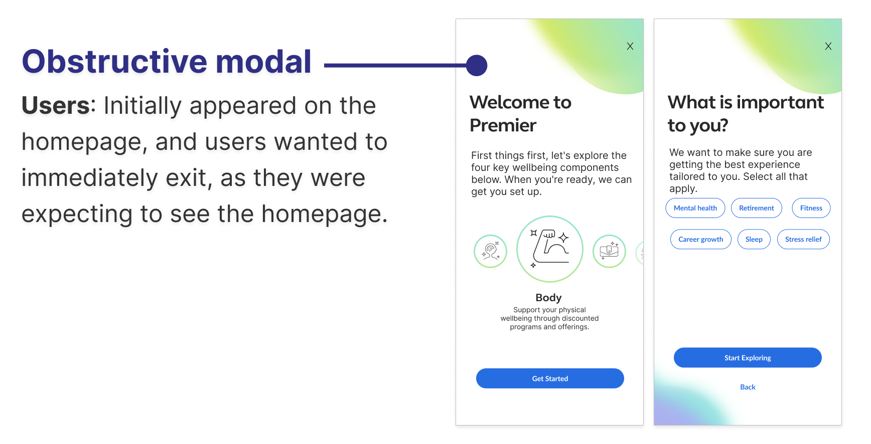
FINAL PREFERENCE MODAL

Programs landing page
The programs landing page allowed users to browse all wellbeing programs, including personalized and client-featured programs.
INITIAL PROGRAMS LANDING PAGE

FINAL PROGRAMS LANDING PAGE

Impact
Through the offering of wellbeing programs, the employee platform transformed from a basic benefits website into a comprehensive experience that allowed employees to engage in programs to enhance their overall physical, financial, and mental health.
🧘
Wellbeing programs live on platform serving over 36 million employees
🤝🏻
10 new clients upgraded their service to include new programs offering
💻
Prototype used by sales team for client meetings
Key learnings
Advocate for design recommendation with user research feedback, especially in face of pushback for an unideal experience
Use timeboxing and structure to gather feedback efficiently with multiple teams
Create a recorded talktrack as an artifact, which can be shared as post-meeting artifact or to direct answers to questions that were previously addressed